
Pink is making an interiors comeback, and I for one am very happy about this.
It has often been a colour overlooked in the paint spectrum. One can only assume homeowners feared it would make a room feel “too feminine” or “too sweet”. Once used for baby girl nurseries around the world, neutrals and non-gender specific colours have become more popular over the years and pink has fallen out of favour…until now.
This year, making a strong return, Pink is punching some real statements in the latest interior trends, and the tones and hues available are far from the simple bubblegum pinks you may imagine. Here’s a go-to guide on how to cheer up your home using the power of pink;
Adding Warmth: Terracotta pink
That sunny, Mediterranean vibe which has been all over Instagram this Summer is here to stay, with its warm, earthy and nostalgic feel.
Burnt sunset-pink works beautifully for indoor-outdoor spaces and looks stunning with large ferns and sculptural plants, textured walls and crisp whites. The partnership with a neutral is very important for this shade, as it gives a smart sharpness to the look and keeps it feeling modern. Think of this warm hue as the bronzer to a makeup routine – it needs a solid foundation in order to work.
For an unexpected clash, view this earthy tone next to a deep inky navy blue.
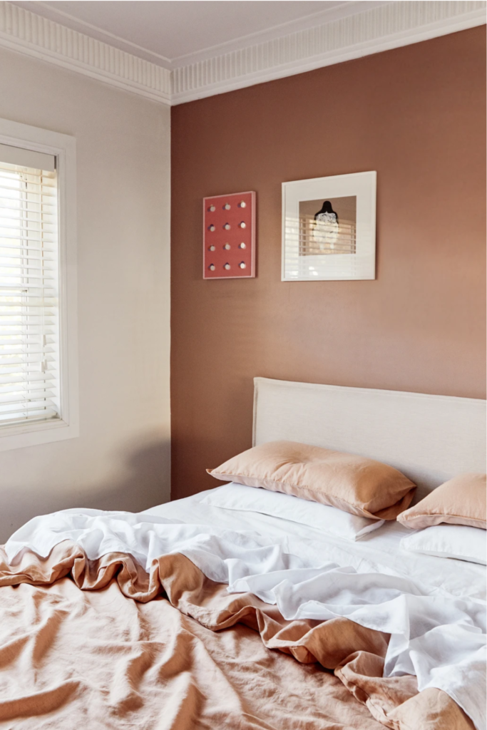
Suggested Paint Colour: Farrow & Ball’s Book Room Red.
Team with: Farrow & Ball’s Skimming Stone
Hint of Colour: Barely There-Pink
The opposite end of the spectrum is a barely-there hint of pink and is beautifully classic. The subtle tint of colour allows pink to be part of your interior scheme, without taking centre stage.
Its warmer than fresh white, and softer than ivory, but still won’t feel “too pink”.
This shade is ideal for bedrooms but will look equally interesting in a panelled Hallway, providing a warm neutral base with a touch of colour. If you’re also a fan of grey, this pinky shade will sit elegantly with warm neutrals such as gunmetal grey or stones.
Suggested Paint Colour: Benjamin Moore’s Foggy Morning
Team with: Benjamin Moore’s WoodcliffLake
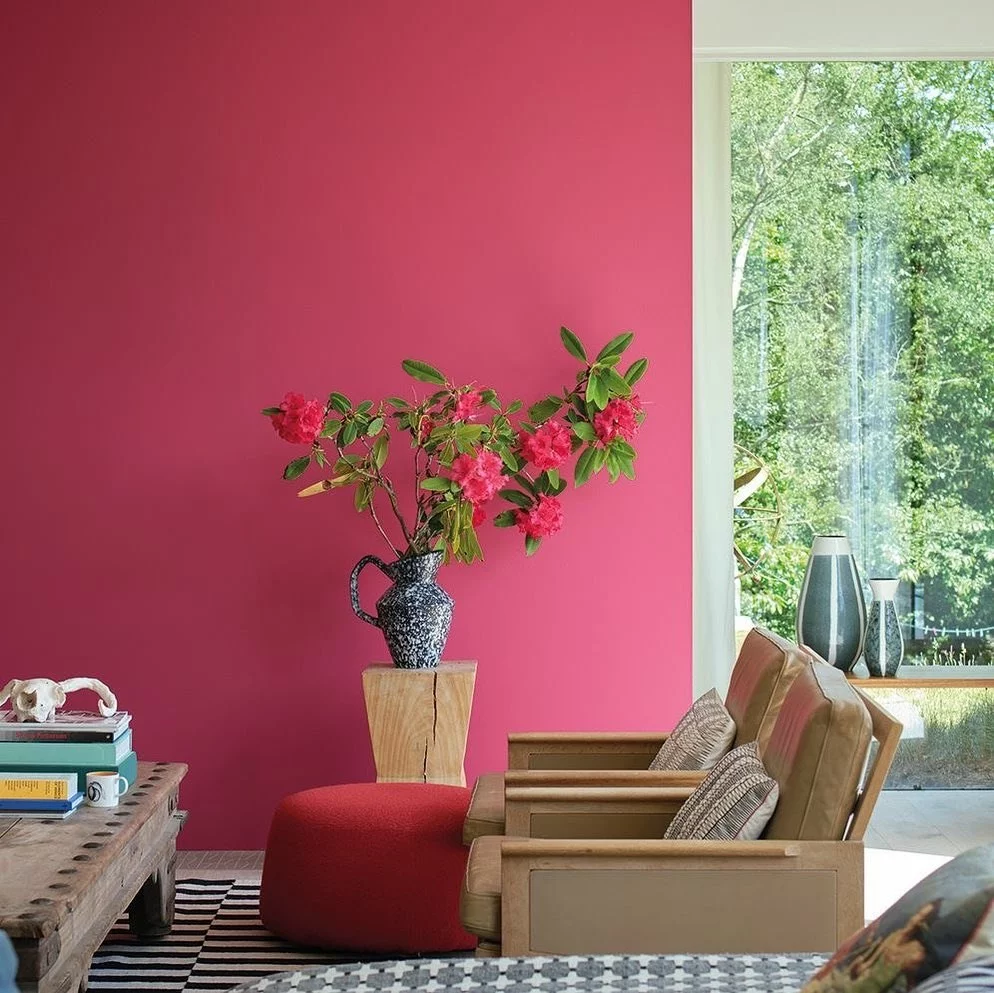
For the Bold: Fuchsia Pink
A colour not often selected in favour of trendy blues and greens, Fuchsia provides an instant hit of personality. Its perfectly balanced mix of red and pink, with a splash of purple, makes it an ideal accent colour.
Try on a feature wall, or just in small doses to doll up a timeless neutral. This colour can come to life with brass gold accents and green plants.
Suggested Paint Colour: Little Greene Paint Company’s Leather
Team with: Little Greene Paint Company’s Loft White
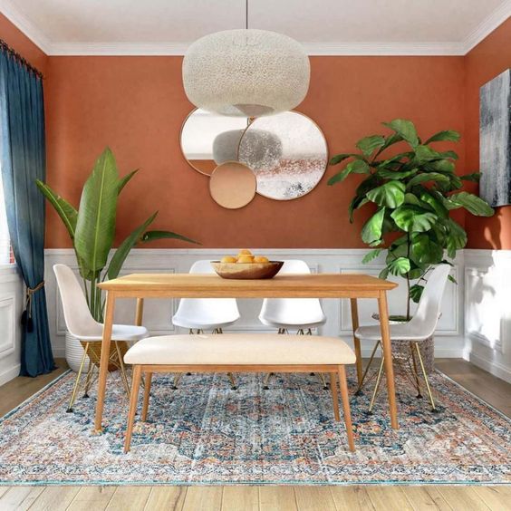
To feel Cheerful: Cherry Pink
Much like Fuchsia, this shade of pink is strong and you may find it too overpowering to splash all over your walls. But as an accent colour, it can fill your room with positive vibes and an almost retro nod. Cherry is created with more red than pink, making it feel bold and inviting, and a great colour for dining rooms. Mix with warm whites or linen shades to tone it down, but avoid greys which will dampen this shade’s spirits.
Suggested Paint Colour: Farrow & Ball’s LakeRed
Team with: Farrow & Ball’s Skimmed Milk White
On Trend: Blush or Nude Pink
A subtle shade of pink, with a dollop of cream, this pretty shade is fast becoming the most loved colour for interiors this year. Like a good foundation, it creates a beautifully creamy base on which other tones and colours can sit effortlessly.
Mix it with stripped down woods, copper or gold accessories or handles and you can even throw it next to contrasting dusky green-grey to really bring out the colour.
Suggested Paint Colour: Lick Paint’s Dusty Pink 02
Team with: Lick Paint’s Green 03
Stay Subtle: Peachy Pink
Peach may remind many people of some sickly sweet rooms from the 70s, but this contemporary take on the classic is not one to overlook.
The smallest tinge of orange takes a sweet blush into the peachy tones and feels elegant, adult and chic.
It makes a great all-over colour for a bedroom or playroom as it feels warm but not overpowering, and works very well with other pastel shades such as ferny greens and mustards.
Suggested Paint Colour: Coat Paint’s Kitchen Disco (True Orange Peach)
Team with: Coat Paint’s Moritz (Grubby Dark Yellow)
Pink without Paint
If going the whole way with pink fills you with fear, there are ways to introduce all the pretty pinks listed above, without getting out the paintbrush;
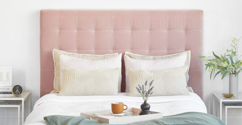
- Introduce pink into small details, such as a ditsy wallpaper to line the inside of a wardrobe or in soft furnishings to break up a neutral scheme. The richer tones like cherry and hot pinks look fantastically luxurious in velvet fabrics for cushions on a bed or sofa, or add a beautiful statement headboard in pastel pink velour.
- Pops of strong pinks add style and interest to a white kitchen in small doses. Look for colour in small appliances like your kettle and toaster to add a little bit of interest. A vase of pretty pink peonies add instant colour too.
- Well chosen accessories with a mix of pink and terracotta shades can really bring life to a bland room. Frame artwork in a contemporary style and mix prints and textures for an eclectic look, to bring in the colour without committing to an entirely pink room.
- Try adding a pink accent chair to a reading corner or bedroom setting. Its always surprising how just one bold coloured piece can lift the whole scheme and bring in right on trend. Its also easy to change should you fancy something different next year.
- Bathrooms are often left white and neutral, but adding colour is an instant and affordable way to create a unique look – and why not give your bathroom or en-suite a fresh pink makeover? Look for terracotta pink tiles in authentic patterns for maximum interest, or select a peachy pink bathroom vanity unit instead of the usual grey or white. Black or brass taps and accessories will look gorgeous with this colour palette.

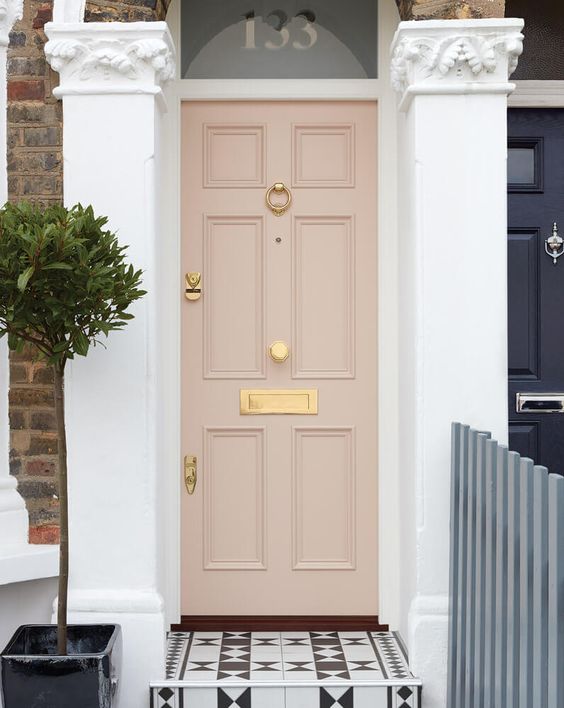
- And finally, for a really cheerful welcome home after a long commute, consider giving your front door the power of pink too. Instantly uplifting and full of personality, painting your front door in any of the shades descries above is sure to make you and all your neighbours smile.
For more inspiration and ideas, take a look at all our recent projects