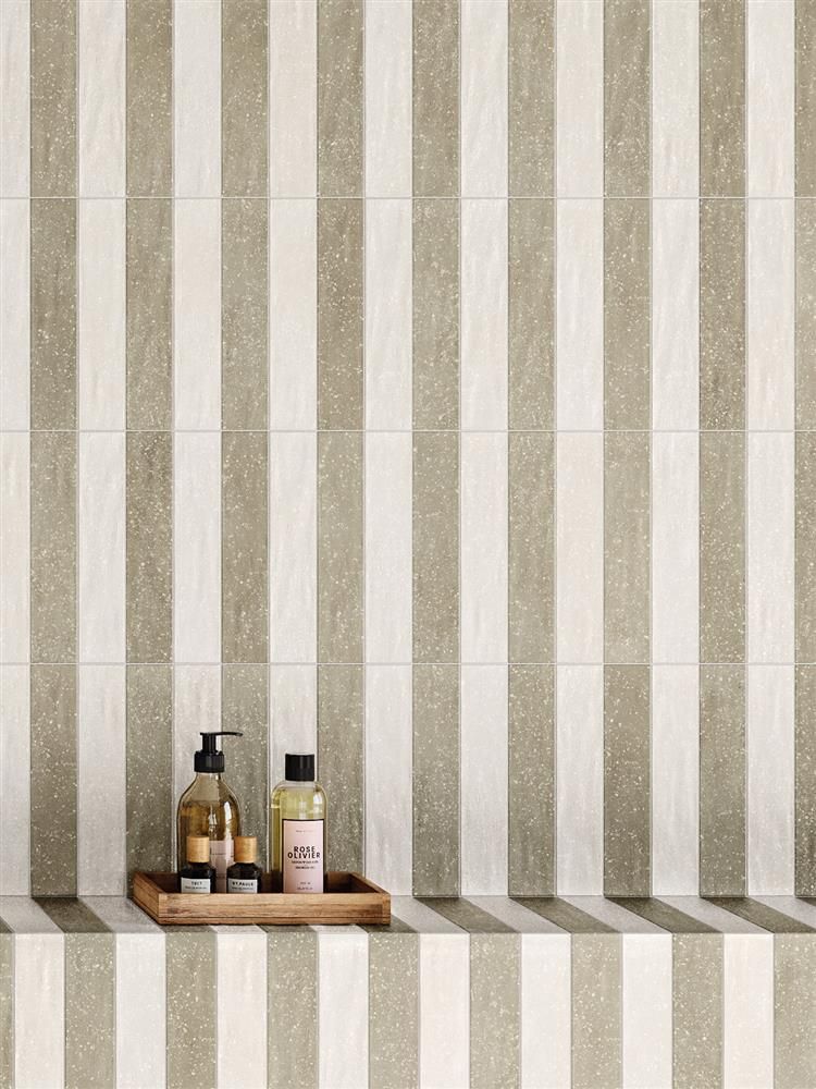
The humble stripe. One of the most classic pattern forms, the stripe has had a, ahem, chequered past.
Originally a symbol of lower class, stripes were worn by society outcasts (think prisoners or a Burglar Bill). However, when society grew tired of ornate Chinoiserie and over-indulgent design in the late 18th century, stripes grew in popularity and were commonly used in textiles for mattresses and upholstery. Bu the 19th century were favoured by royalty and politicians, making it a fashionable choice.
A strong element of the 1930s Art Deco movement, stripes were often found in monochromatic schemes adding drama and elegance. By the 1960s and 70s, stripes were softer, wavy and more playful, mixed with funky colours.
As fashion and interior design trends follow each other rather closely, we have seen stripes remain a steady pattern choice and is ideal for people who don’t “do pattern”. Its ths stripe’s comforting rhythum which seems to drawn in most people, adding pattern which doesn’t have to shout, or splashing in some drama when needed.
Embraced in all their many forms, scales and colours, stripes are a staple in the interior design world, and in this blog, we’ll explore how and where to celebrate them:
I deisgned this girl's bedroom with lilac broad stripes to add fun and playfulness
Regular stripes
A confident, regular stripe can bring a plain room to life, providing rhythm and pattern in a subtle manner. Teaming stripes in contrasting colours offers a bolder look, where more muted, closer colours are softer and easier to live with.
Add to a children’s bedroom or small home office, and treat as a backdrop to add just enough interest one which artwork, plants and other wall decor can be added.
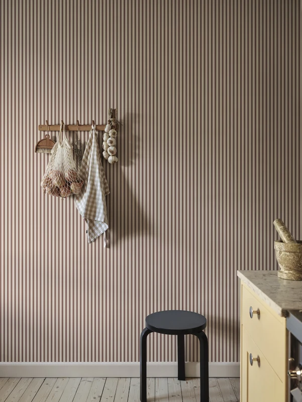
Pinstripes
One of my personal favourite stripes, the pinstripe offers just enough splash of a colour to bring a plainer background to life. Bonus pints if the background is neutral and natuarl and plays homage to the sack cloth stripes of our past.
This is and ideal stripe to feature on a footstool or feature piece, adding classic charm without feeling predictable.
Pinstripes feel cool and elegant, and can be easier to live with
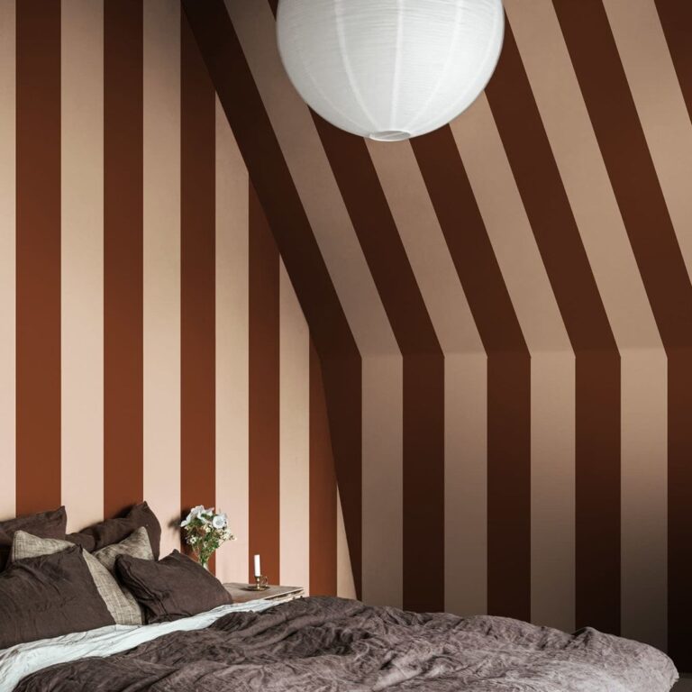
Broad stripes
Getting bolder, the broad stripe remind us that classic patterns can still add drama. If you feel confident enough, change the direction of this stripe or add to a ceiling nook to maximise its impact.
The broad stripe also looks fantastic in cushions, throws and bedding, and will lift a plainer painted room without too much fuss. Mix with florals and plains for a fool-proof scatter cushions arrangement – trust me, it always looks good.
Broad stripes are bolder and work well with tonal colours
Optical Illusions
Stripes are the perfect way to create optical illusions in a space. Vertical stripes elongate walls and take the eye upwards, whilst horizontal stripes widen a room.
Diagonal can make one’s eyes a little dizzy and feels less contemporary, but depending on their placement and application, certainly make a statement.
Stripes are a great way to play with optical illusions in your space.
Irregular Stripes
Who made the rule that stripes had to be neat and straight?
Express your creative self by choosing a rebellious stripe which is off-beat.
Try wavy stripes, dots instead of lines, or woven textured stripes for upholstery. This takes the humble stripe and gives it quirky twist, blending the classic pattern with the creative.
The classic vertical stripe but with a twist, Etsy
Textured and 3D Stripes
Wallpaper and fabric collections are full of classic stripe options – in fact we are spoilt for choice. And whilst there is nothing more pleasing to the eye than a beautifully striped drape or cushion, there are more ways to achieve this regular rhythmic pattern.
Textured walls are still a huge trend in interior design, and we only have to look at the many slatted walls on social media to see how a visual stripe still appeals. But I encourage you to find a fresh new path, adding striped texture with fluting, reeding or strip paneling.
This feels altogether more considered, less trendy and more timeless…and still gives the same effect as a classic stripey print.
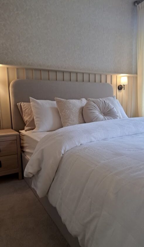
I deisgned this bedroom with vertical strips and wallpaper above
My top 5 places to use stripes:
Tiny Nooks
Small cosy spaces work beautifully with stripes as its not overwhelming in a more compact space. Think reading corners, landing alcoves or snug corners of the room.
Wrap the stripes around all walls and even the ceiling for a canopy effect you won’t regret
Ceilings:
Keep you walls simple, and let your ceiling bring the drama. A striped ceiling is bold and feels braver than papering the walls.
Top tip: hire a great decorator with an eye for detail to avoid staring at the slightest stripe running out of line at 2am.
Let your ceiling be the showstopper with a bold stripe
Half walls:
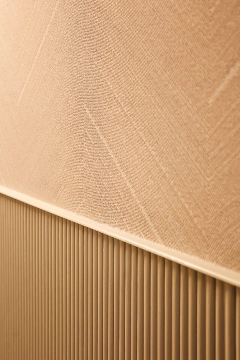
Team a textured vertical stripe (such as this oak reeded paneling) with a touchable textured wallpaper above. The combination of textures, natural woodgrain and regular lines are pleasing and interesting – ideal for an entryway.
Mix textured stripes with wallpaper for a tonal and textured mix